Behind every great startup, there’s normally a great user experience. Even so, design elements are often overlooked by founders in favour of revenue-makers like sales and business development.
That shouldn’t be the case. Today, users want transparency but they also want personalisation, comprehensiveness and simplicity. Understanding how to get this balance right and how to give your platform a stand out design can be the difference between success and failure in a competitive marketplace.
So, here are five key tips to get user experience (UX) right early on — and help your business flourish in the long run.
1/ User design is not an add-on
The most common faux pas I see young software companies make is to treat the design of their user experience as an afterthought. If you’re a SaaS platform, UX needs to be at the core of what your company does and feed into every element of your business. Users will pick up on it when it’s not.
Our service covers life insurance, income protection and critical illness cover, so for us, keeping everything in-house — like branding and tone of voice — means we have control of our identity. It ensures the nuances of complicated products like life insurance and sensitive topics like death.
Having design at your core also allows you to adapt to user insights immediately. Having at least one member of the design or marketing team in-house means you’re less likely to get bogged down with a single iteration of your platform.
2/ You should be jargon-busting
No matter what your UX is, there must be a focus on making information accessible. Customers don’t enjoy being kept in the dark, even if a product is hugely complex. Your UX should address what information your customer wants and how much of it they need.
In the insurance industry, we have a particularly irksome relationship with jargon, so our platform is heavily based on making information understandable. For complex products, this often means layering information — i.e. starting with the basics and elaborating as the customer makes their needs clearer. We’ll start with a simple diagram or an overview of the pros/cons, for example, then link to further reading.
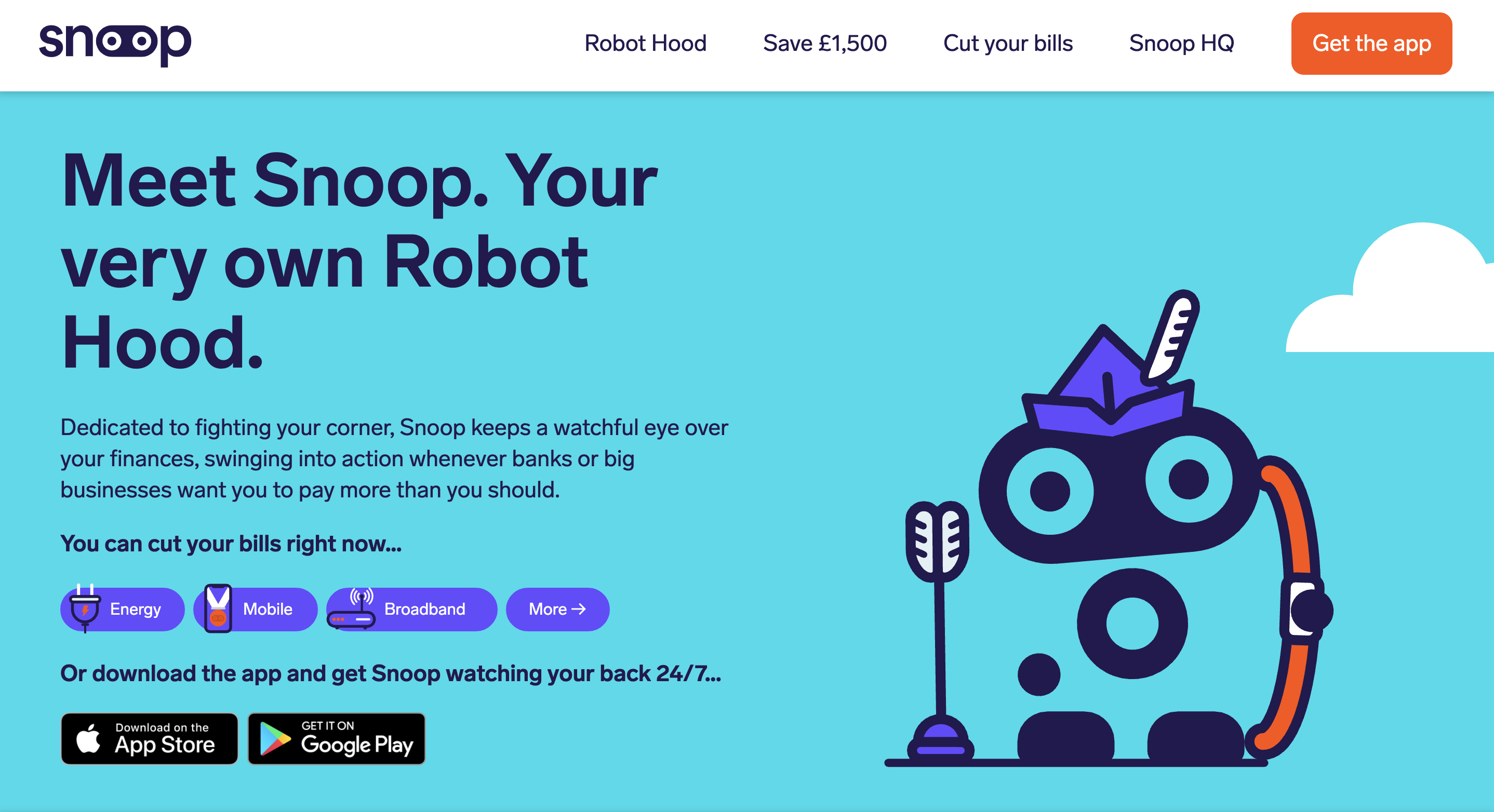
Another great example is Snoop, the financial planning app. They organise information on their platform according to user goals — whether that’s saving £1.5k or helping people to retire early — so that they provide information relevant to their users’ aims only. They also lean on case studies, so users learn about the different options through the words of their users, instead of being dictated by the site. Not overwhelming your users with information is just as important as being transparent.
3/ Identify 'drop-offs' early in the design process
You can make a platform easy to use (but not dumb it down) by identifying and addressing where users drop-off — or leave your site, app or service — early on (particularly if you need to get data from users before delivering your service). Drop-off points might take the form of information users don’t have to hand, complicated requests or simply feeling overwhelmed by a task.
Do away with any kind of long-form. If you’re asking questions, keep them short, with a page per theme so users don’t feel too much is being asked of them. Providing the opportunity to estimate information and amend answers later also helps to maintain momentum, as this allows users to immediately see which products might suit them, instead of making them wait (and likely sending them elsewhere).
It’s also key to understand the circumstances in which users will be engaging with your service. In our case, we accept life insurance isn’t much of a priority for people, so we’ve deliberately designed a journey that can be completed on mobile whilst on a bus.
Tools like statistical averages and sliding scales support data-driven estimation and keep users moving through the process. Recognising what information and time people will realistically have throughout their user journey should shape how you design your experience.
4/ Personality and visuals are for the customer, not branding
Put simply, your visual identity is there for the customer’s benefit, not branding purposes. Too much personality and your UX can feel heavy-handed and distracting, so it’s important to dial down the personable elements of your site when dealing with complicated or personal information. User research is critical to understanding customer wants, needs, pain points and mindsets — all of which should inform the overall look and tone of your platform.
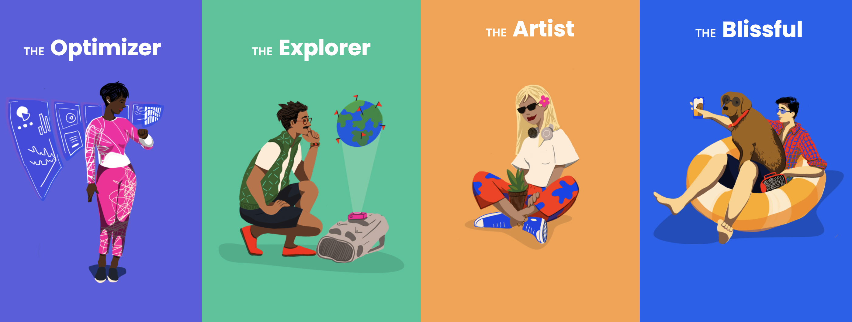
Quirk uses cartoons to help users create 'Money Personality Types' at the beginning of their journey. These illustrations give their UX a certain playfulness and reinforce the visual quality of the platform, but they're replaced by simple icons when helping users navigate different budgeting options. Important user information should never be treated frivolously. Visual identity can be a great way to set your platform apart — but remember, your UX should focus on treating the customer with respect.
5/ UX will be about anticipation
Simply building ‘customer-centric’ UX won’t quite cut it in the future. Truly ahead-of-the-game companies will anticipate customer needs with a view to becoming long-term companions, not just a one-time service.
To stay ahead of the times, design your UX with this hyperpersonalised reality in mind. An example would be using existing data to predict when a user’s circumstances will change and nudging them to update their details, ensuring they have the right products in place for them.
Understanding how your UX fits into your users’ wider lives, and the other products they use, will help to inform better, more intelligent UX.
Tiina Björk is chief design officer at Anorak, the independent online broker for life insurance, income protection and critical illness.